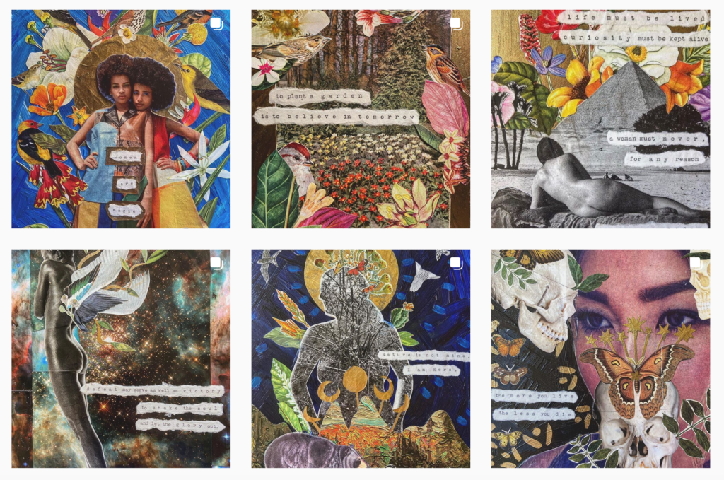
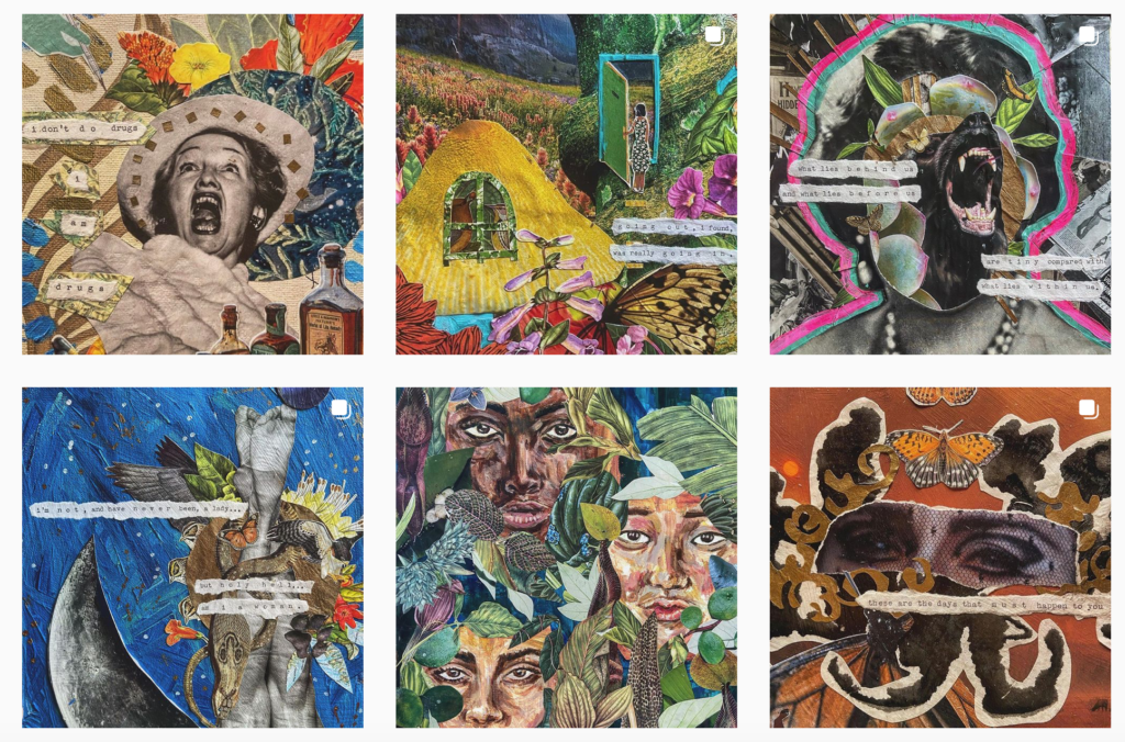
Hannah Ricke is a US collage artist. She bases her art around quotes that she prints from her grandmother’s typewriter. Her main influences are women, nature, and “the power between the two.” She work on paper and does not make her collages into prints.
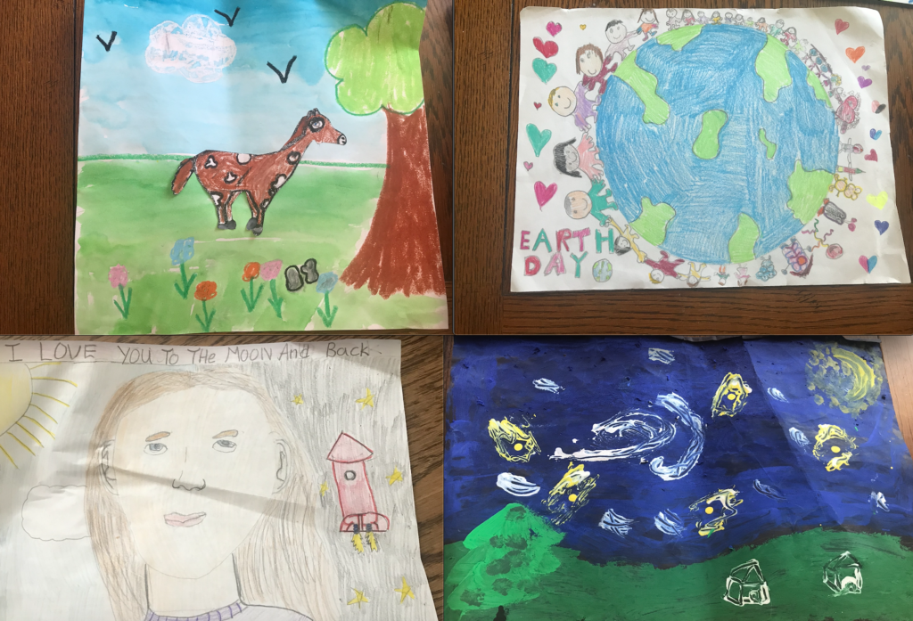
I am thinking about doing my collage based around different pieces of my childhood. I have some of my drawings from when I was little that I might try to incorporate along with some more images and possibly a quote like in Hannah Ricke’s collages.
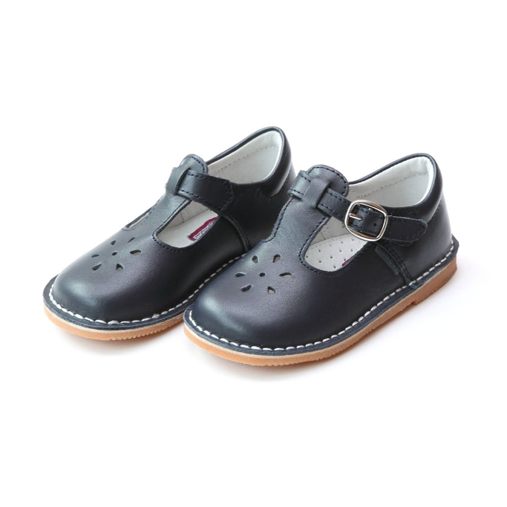
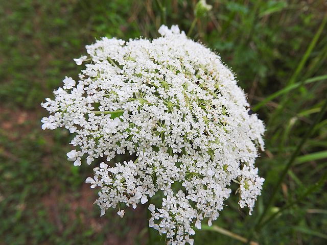

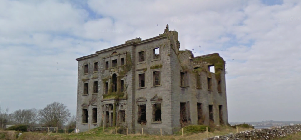
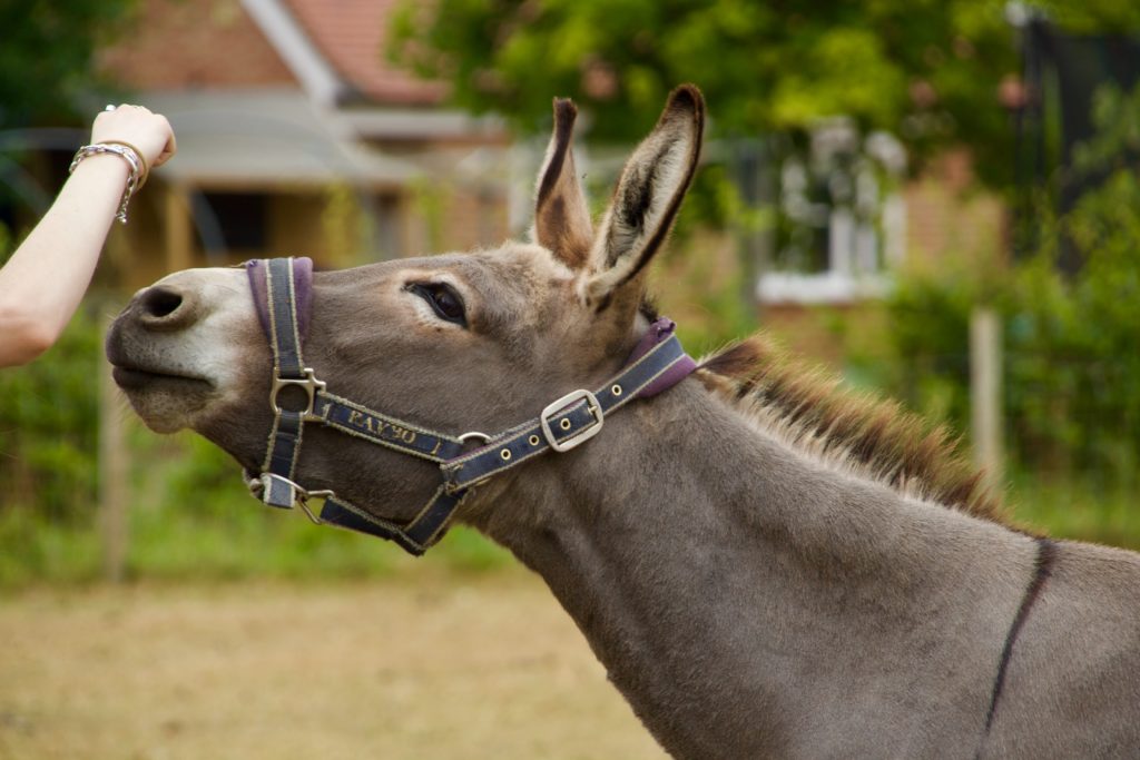
These are my three ideas: First is different architecture from different parts of my life, Second is me in a princess dress and a drawing from when I was little, Third is my friends and film photographs I have taken of them.
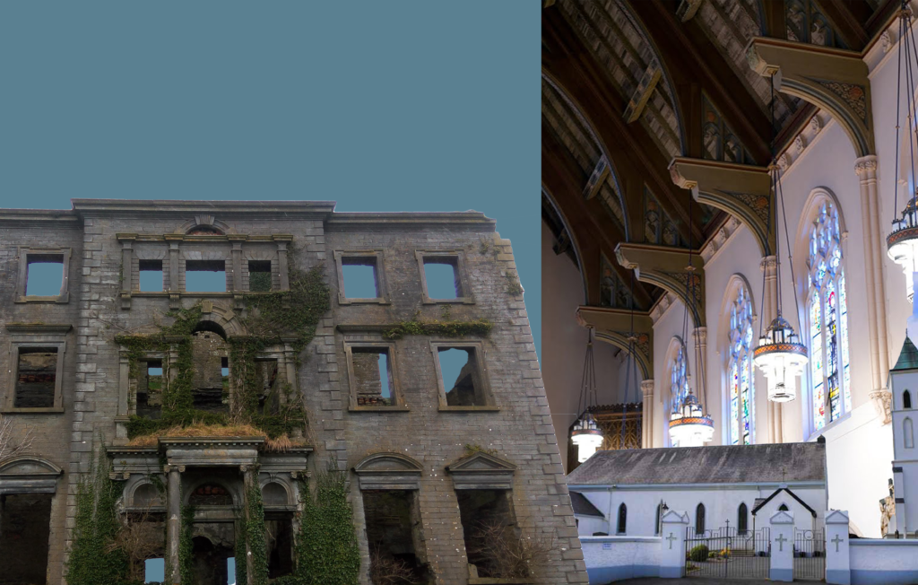
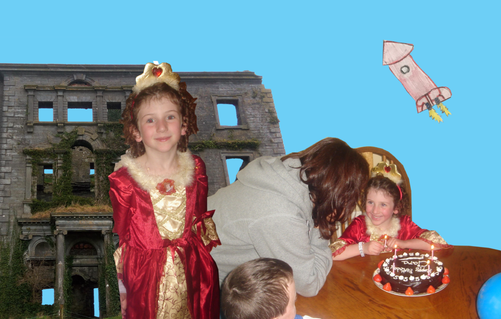
I think I am going to mix at least two of three of these into a diary entry idea which I will insert a sketch of below. I am going to print and scan images, scan drawings, and upload architecture and possibly some photography of mine. The idea is a birthday diary entry from when I was little and to include those images and make it into a birthday wish. I think this will make more sense when it is sketched out.
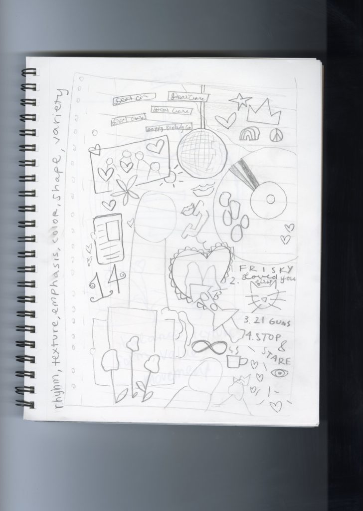
My sketch is above and my first draft is below!
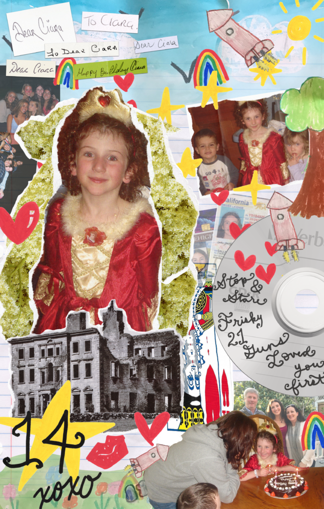
My collage includes photographs from my fifth birthday party. I manipulated these on paper and scanned them to create a paper look while having a digital medium. I also included drawings from when I was younger. The sky, grass, trees, and rocket ships depict what I saw at that age. Other childhood memories such as elderflower, a playing card, and Tyrone House depict memories from my childhood. I included the songs that were my favorite as a child, as I used to do in my diary as a kid. When I would make these entries, I always imagined what life might be like when I was older. I included some faded pictures to represent dreams of mine from my childhood. On the left you can see pictures of me and my friends. In the middle, my license, debit card, and school ID all represent growing up. On the bottom right, a photograph from my prom with my parents is included.
The elements of design that drove my project were emphasis, shape, variety, rhythm, and texture. The emphasis can be seen in the focal point of the large solo photo. This was inspired by Hannah Ricke’s focal points in her work. Shape is scattered all around the image with typical childhood shapes of stars and hearts and rainbows. These, along with the drawings from my childhood, simplify what art was for me. Variety is seen throughout the whole project with a mismatch of images from my childhood. The “scattered” look that emphasizes variety shows how my diary entries were made and followed into this project. The repetition of these scattered shapes in the images and decals has rhythm and movement, drawing your eye throughout the image. Lastly, texture really inspired my image. I wanted different paper textures such as folded images, crumpled binder paper, and ripped edges.
Great research-looking forward to seeing the finished product.