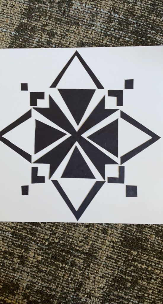
I really like your design. It reminds me of the Bethlehem Star and the thick black lines that draw toward the center really grab your attention and make you look at the center first before seeing the whole piece.
Nice job on the Notan. It would look really nice if you mounted on the black paper. I agree with the Bethlehem Star interpretation-simple and elegant design. The square is a bit too dominate and could have been dissolved had additional smaller triangles or shapes been cut from the edges.