I really like your 4th design featuring the circles and curvalinear lines. The graduation from large to small curves toward the lower right corner is really strong aesthetically.
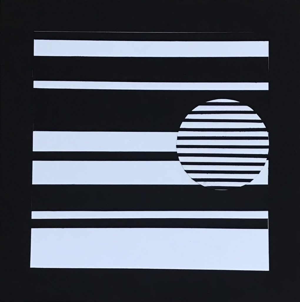
I really liked your contrast of thick and thin horizontal lines in the 1st design. I think the circle detail with small thin horizontal lines makes the piece even stronger!
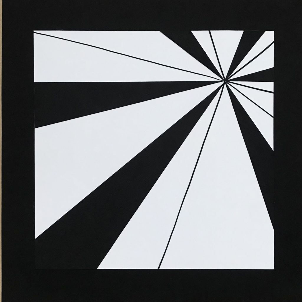
I really like your 3rd design. The angle the lines are at makes you feel that you’re moving in a tube or something that entirely surrounds you. The varying thicknesses of the lines really adds something to the piece.
I love the “eye” look you mentioned you were going for in your fourth design. The diversity of sizes and the way they funnel to the corner draws the eye to the corner and creates an illusion of a staring eye. This is intensified by the placement of the inner circle and the negative space in the oval.
Terrific variation to your designs. Consider varying the line width for the focal point design. See my Pinterest page https://www.pinterest.com/deirdremurphy50/2d-focal-point/
Your 1st and 4th design are terrific in both design and craftsmanship! Keep up the good work.
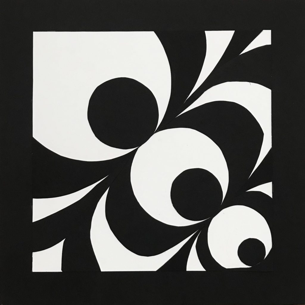
I really like your 4th design featuring the circles and curvalinear lines. The graduation from large to small curves toward the lower right corner is really strong aesthetically.
I really liked your contrast of thick and thin horizontal lines in the 1st design. I think the circle detail with small thin horizontal lines makes the piece even stronger!
I really like your 3rd design. The angle the lines are at makes you feel that you’re moving in a tube or something that entirely surrounds you. The varying thicknesses of the lines really adds something to the piece.
I love the “eye” look you mentioned you were going for in your fourth design. The diversity of sizes and the way they funnel to the corner draws the eye to the corner and creates an illusion of a staring eye. This is intensified by the placement of the inner circle and the negative space in the oval.
Terrific variation to your designs. Consider varying the line width for the focal point design. See my Pinterest page
https://www.pinterest.com/deirdremurphy50/2d-focal-point/
Your 1st and 4th design are terrific in both design and craftsmanship! Keep up the good work.