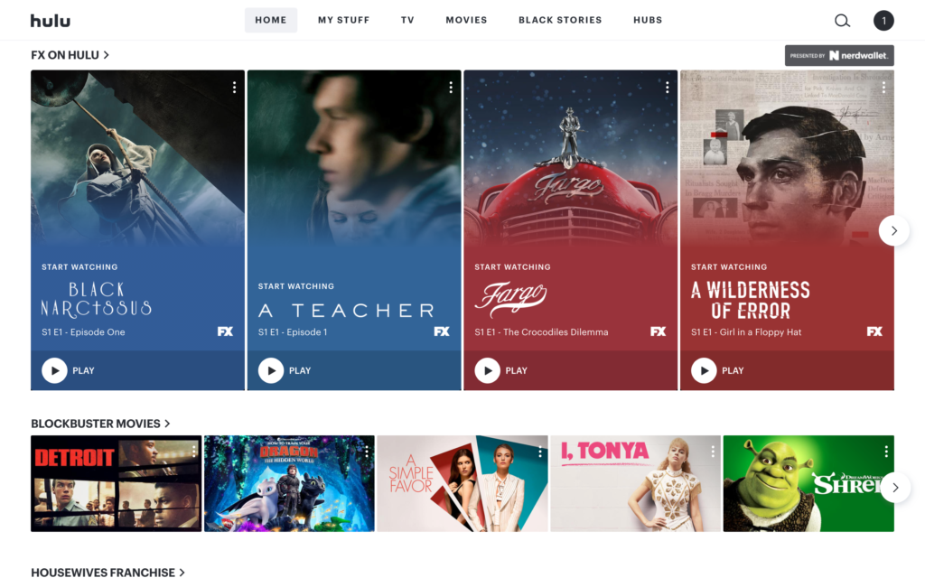
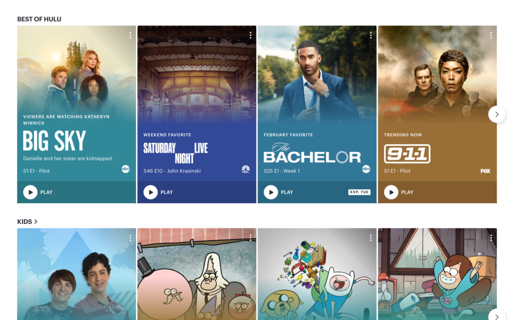
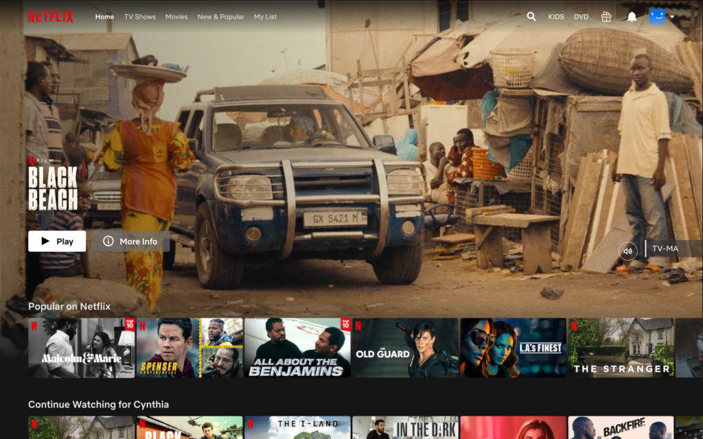
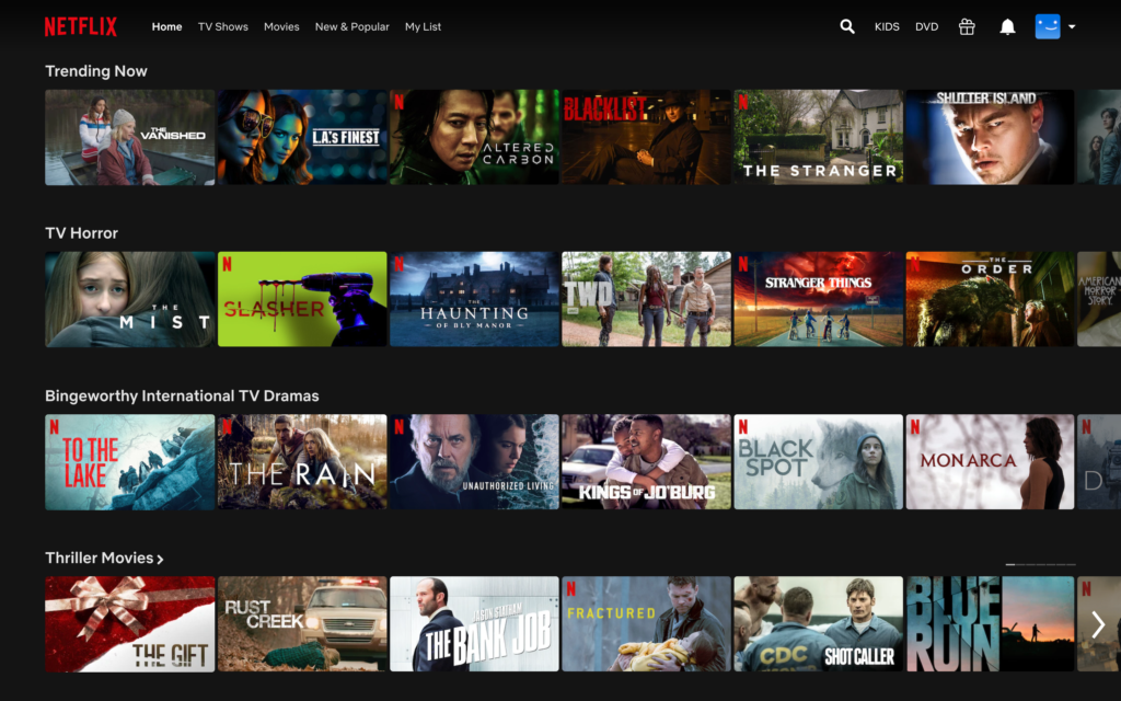
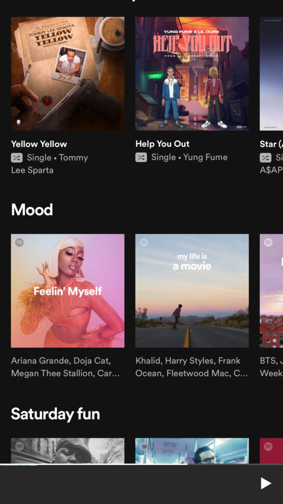
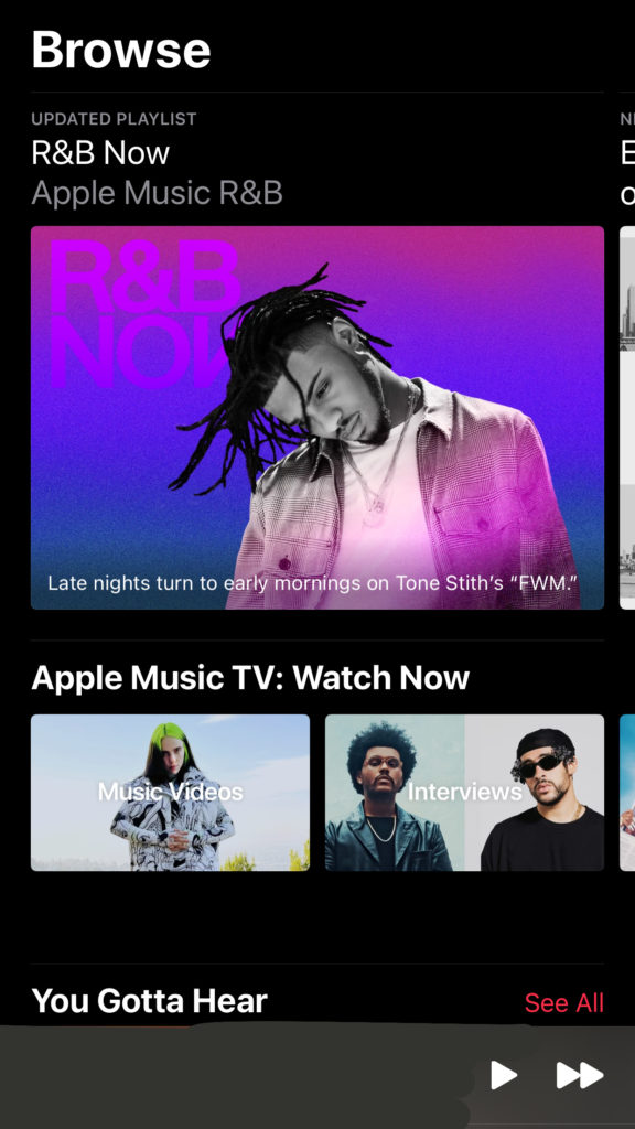
Good Design 1: Hulu Homepage. The way the shows/movies are categorized/listed are very convenient to the eye, doesn’t have too much going on. The shows have their own individual blocks with a thumbnail of the show. The website is much easier to navigate, with your categories listed above at your convenience and without the hassle. Good website design. Bad Design 1: Netflix Homepage. The homepage for Netflix always gave me a headache, and about 45 minute to find a show/movie that I end up watching. The homepage compared to the Hulu one is very cluttered and not really appealing to the eye. Although, the shows and movies have a picture thumbnail like Hulu, you have to browse and individually click each show to get info and all around isn’t as good of design as Hulu.Good vs Bad 2: Spotify vs. Apple Music Browse Tab. The top picture is the Spotify browse page where you search for new music and the bottom is Apple Music. I think Spotify’s is designed a tad bit better than the Apple one because its labeled and categorized tailored to the listener with the corresponding artists featured in the playlists listed that are ready to listen to… vs. the Apple page where your pushed to watch music videos instead of finding new artists/music.