Caroline Casey
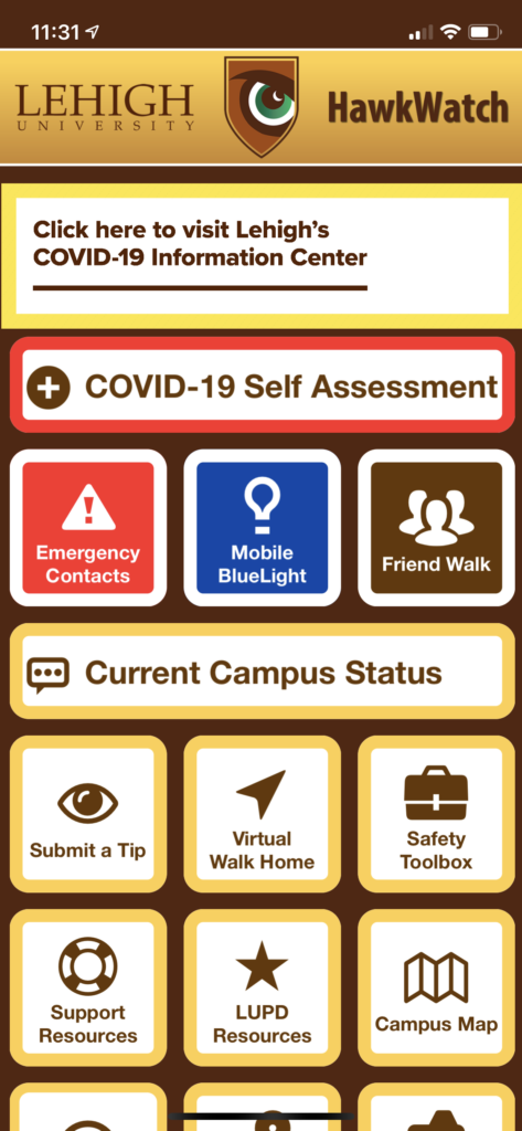
Lehigh’s Hawkwatch app is designed poorly. The main page is way too busy, and the buttons aren’t organized very well. I have accidentally called 911 (more than once) while just holding my phone with the hawk watch app open.
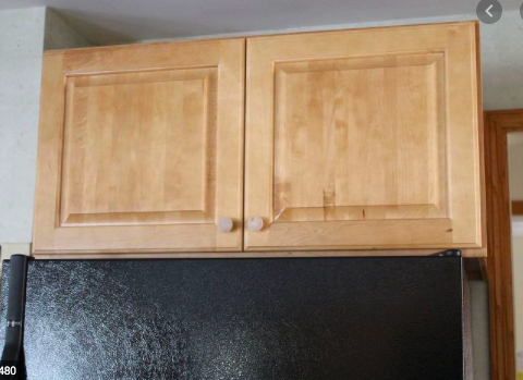
The cabinets above fridges are a bad design. I understand they are there to continue the flow of cabinets in a kitchen aesthetically, but functionality wise, they are a pain. They are extremely hard to reach and to store stuff in, and I don’t think they even look good. Especially in kitchens that don’t have enough storage (so their use is necessary), it can make using the kitchen harder and more stressful.
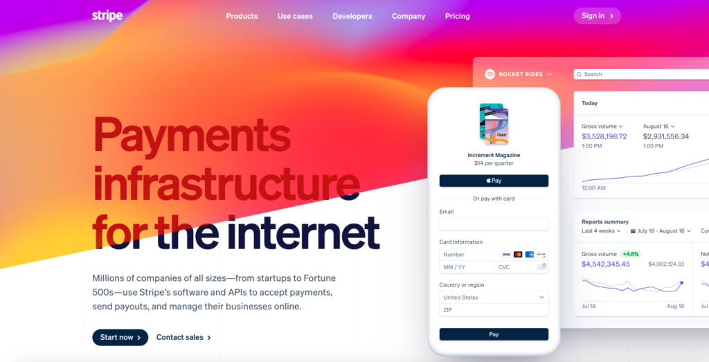
Stripe’s website is one of the nicest pages in my opinion. The live and sometimes interactive graphics along with the flowing color at this home screen make viewing the page very pleasant and easy.
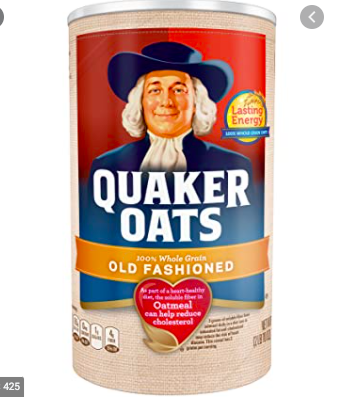
This packaging for Quaker Oats oatmeal is something that I use and appreciate daily. The shape is not bad for storage, and although not pictured, the inside has a nice opening to pour the oatmeal out and into a bowl. The coloring and design of the label is nice, and even the smiling man makes me feel good in the morning.