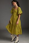
BAD: Anthropologie– The pose doesn’t give life to the product being sold. The background is dark grey, making the overall ad dull and dreary. There is little movement and energy overall, making the ad lifeless.
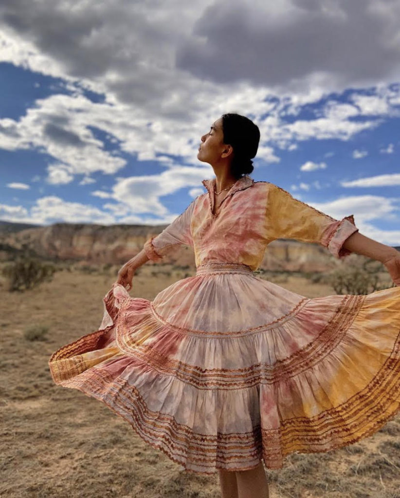
GOOD: Orenda Tribe– Hand-Died Maxi Dress. Orenda Tribe takes it where Anthropologie does not, the model’s pose is dynamic and interesting. The director also contrasts the vibrant colors against a cloudy sky, creating movement in every aspect. The ad carries a lot of emotional appeal in this way.
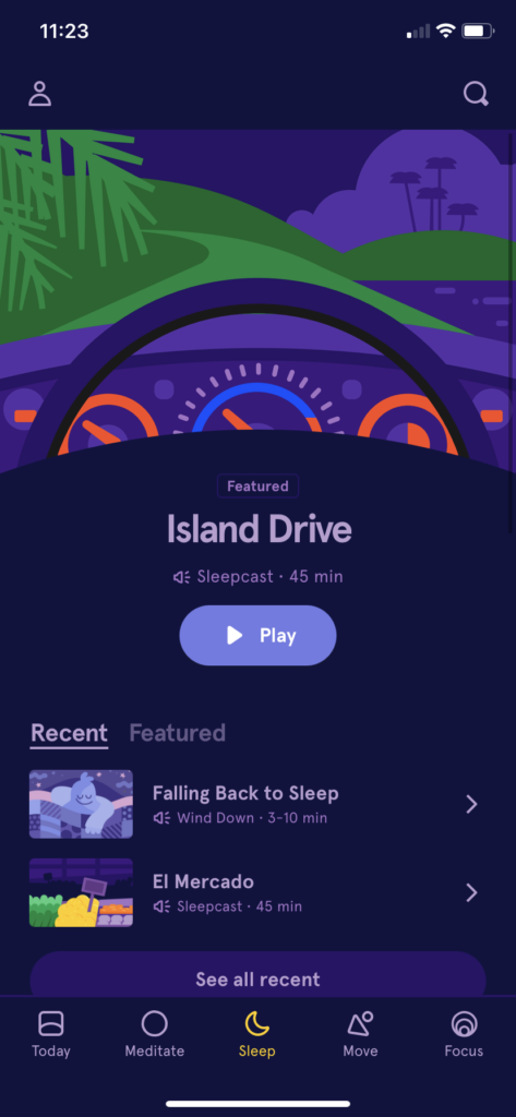
Headspace layout pt.2– GOOD. The layout of headspace, a meditation app, is simple yet elegant. The hue of purple and blue tones give it a calming effect. The font is the same throughout the app, giving it a sense of consistency and stability. It has rational appeal because as a meditation app, it is meant to give users just that: a sense of calm, peace of mind, consistency and stability.
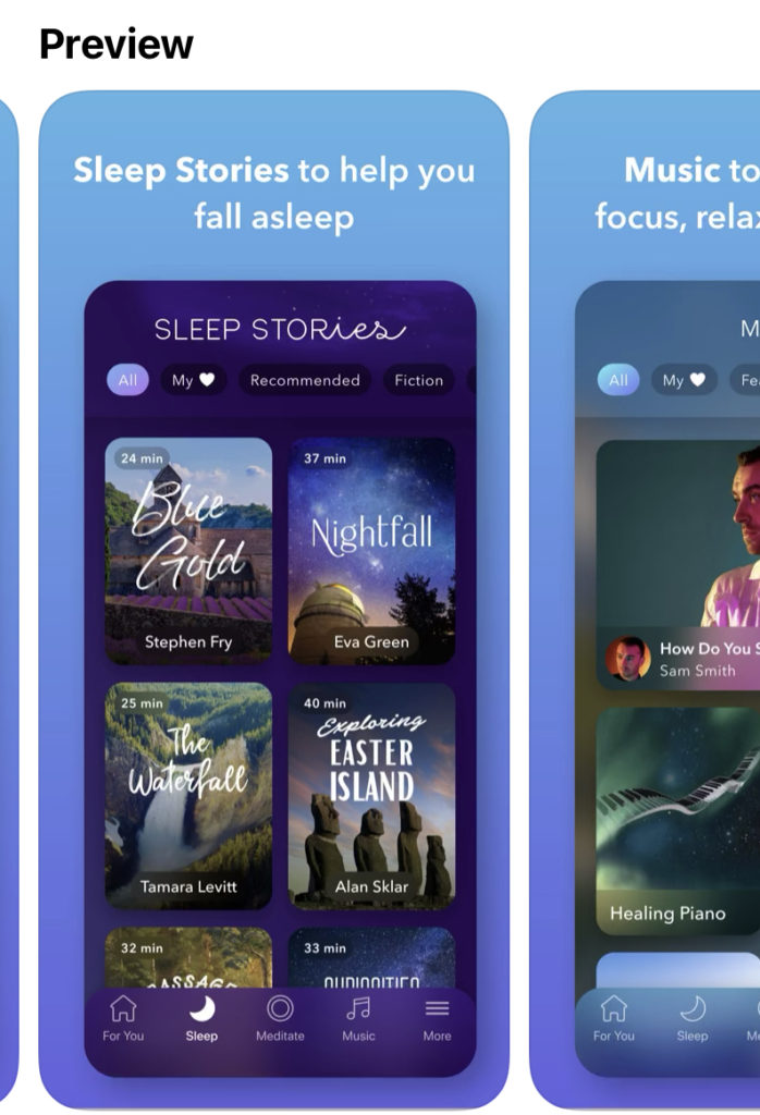
Calm layout– BAD. Calm, another meditation app, has too much going on. The use of different fonts makes it confusing to use. The rectangle blocking is too bold and thus too overwhelming to use for a meditation app.