Skip to content
Good Design
 clear layouts, really good use of color and shape, simple designs
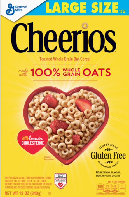 good use of colors and shape (yellow – happy, red – energy), emphasis on benefits like 100% is bigger, clear layout
Bad Design
 very cluttered layout, too much text that could be condensed, not a great use of color
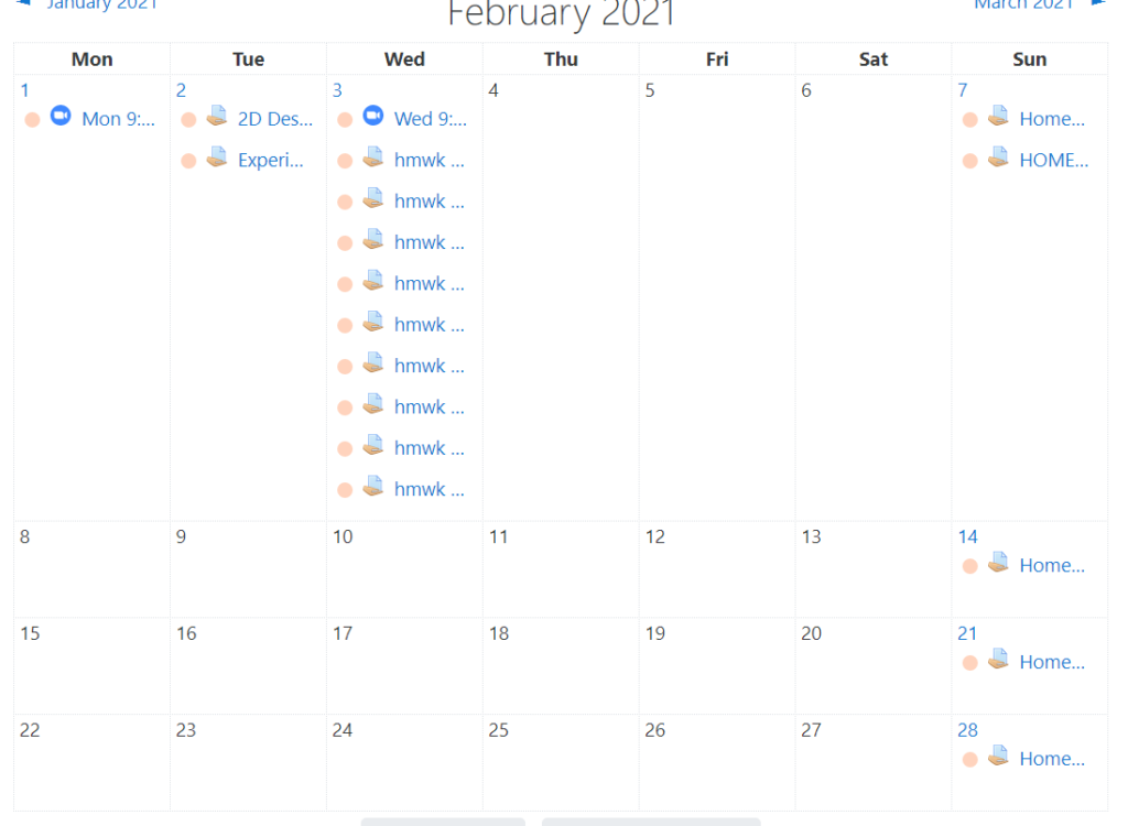 bad use of color to differentiate assignments from different classes,