Bad Designs

- Unnecessarily leaving spaces in between letters and skipping lines, making it confusing to read.
- The use of negative space is meaningless
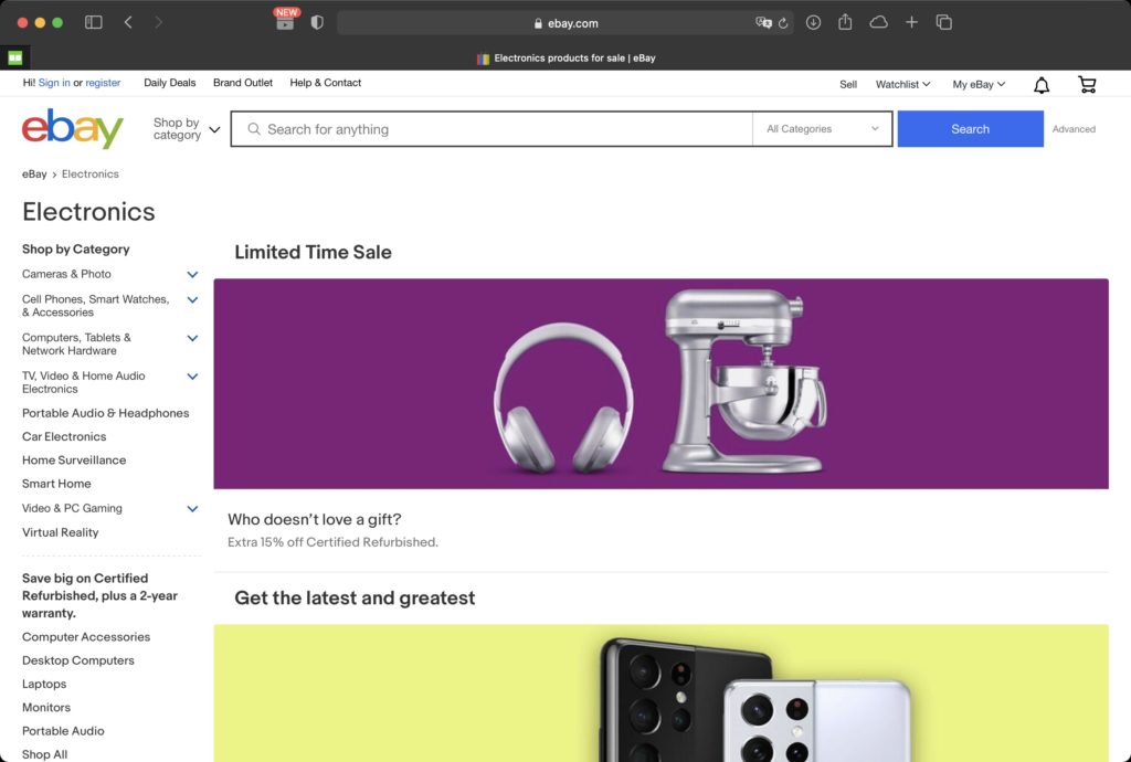
- The promotional content took over the majority of the space, leaving the important links squeezed into the tiny area on the left
Good Design
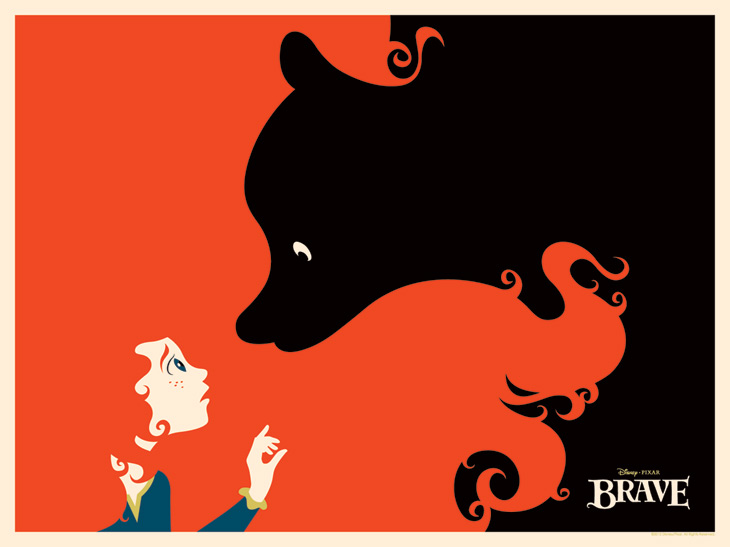
- Bold color and sharp contrast
- Very creative way of using negative space
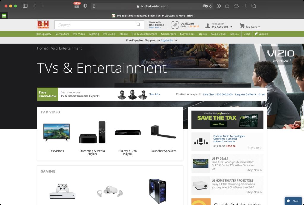
- Important contents (categories) are taking the majority of the space and promotional messages are on the side or in the background
- Categories are clearly labeled and with “sample” pictures