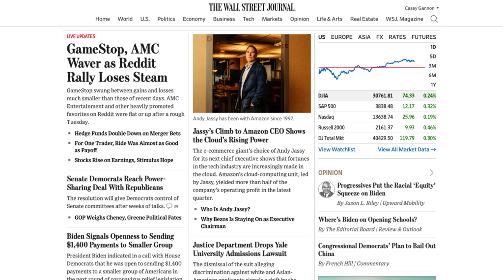
| This is a screenshot of the ATM Finder from the Citibank app. It clearly shows where to find the closest ATM, and all you need to do is zoom in a bit to pinpoint where they are specifically. It also uses their bank’s blue color in a small circle to mark the ATM locations. | This is from a different bank’s app that I found online; however, it shows too many locations. It clutters the screen, and it is not easy to find the closest ATM. The current location pin is barely visible, and the ATM pins are ugly in comparison to the simple, sleek Citibank design. |
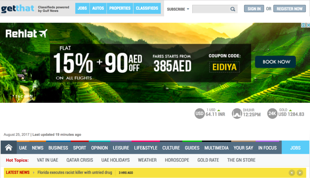
I think that the worst part of this website design is that there are two toolbars, separated by a big advertisement. The bottom toolbar has many tabs that are close to touching, so it is hard to use. I think that the tabs should be more spread out, and the top toolbar should be voided.
The toolbar you see below has the same amount of tabs, but they are more spread apart from each other. You can distinguish them from one another, and they do not stretch from one end of the computer to the other. It is smaller and easier to use.