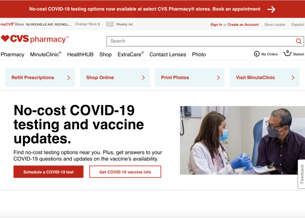
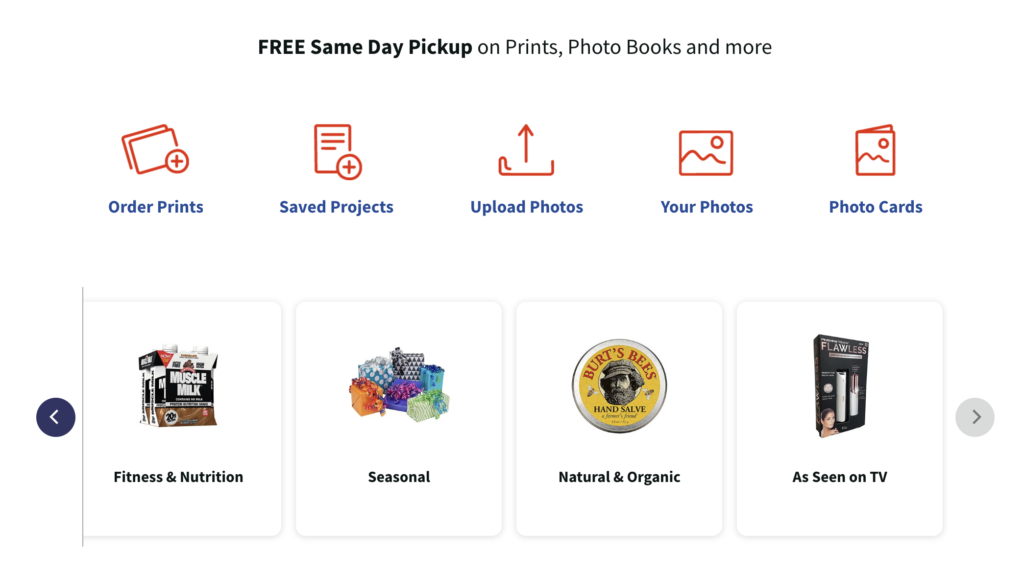
Bad – A lot of repetition of red and white. Words overtake the page. The stock images of many products makes it look busy.
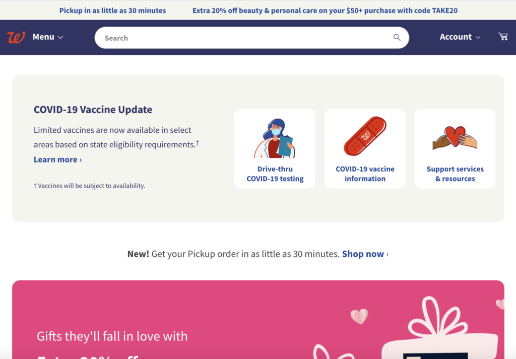
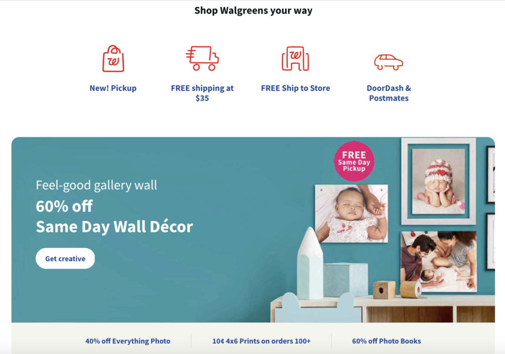
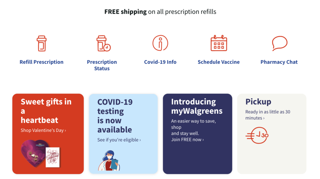
Good – Walgreens uses a larger variety of colors with more contrast. The website uses symbols and clipart rather than stock photos which makes it look simpler. The rounded edges of the boxes gives it a softer and more current look.
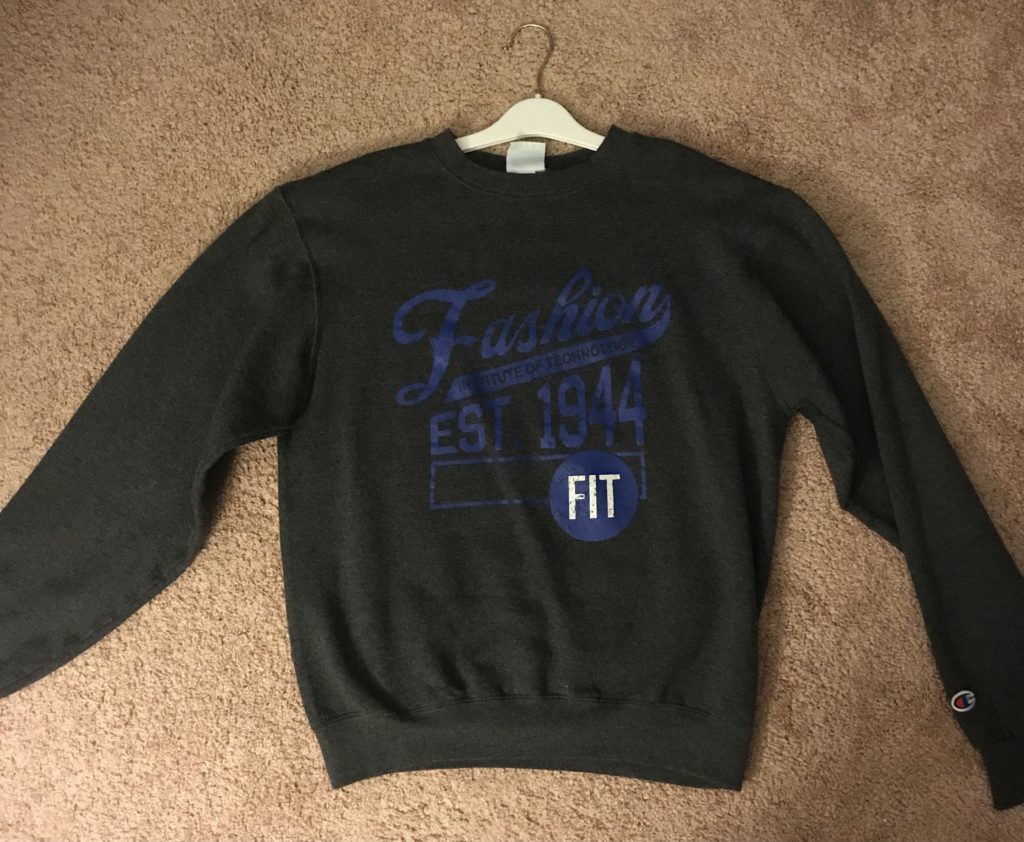
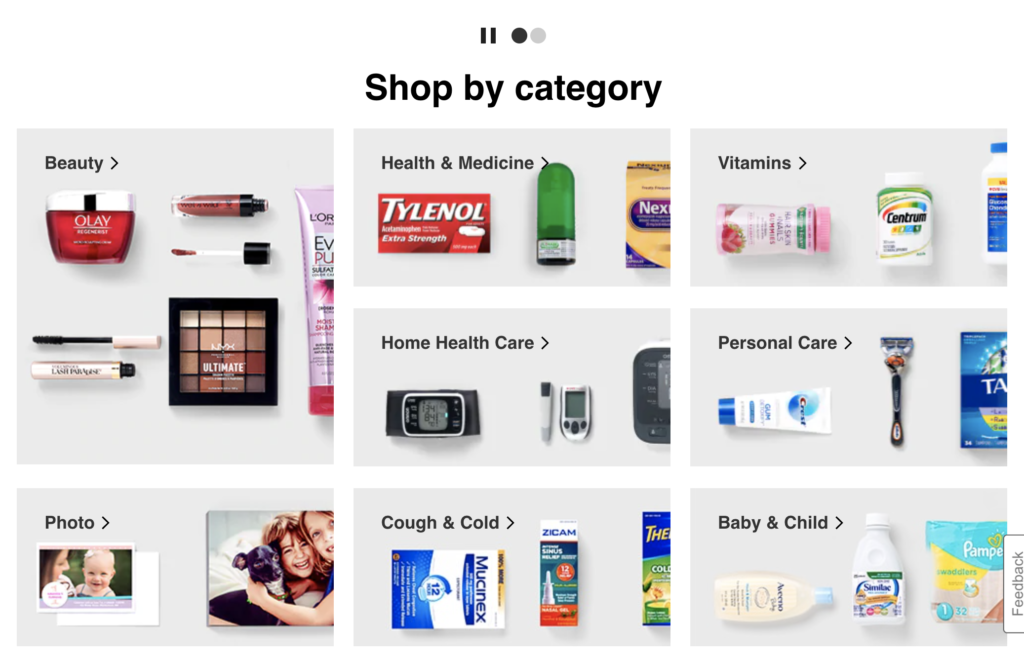
Bad – The dark blue and dark grey don’t contrast enough. It makes it difficult to read. 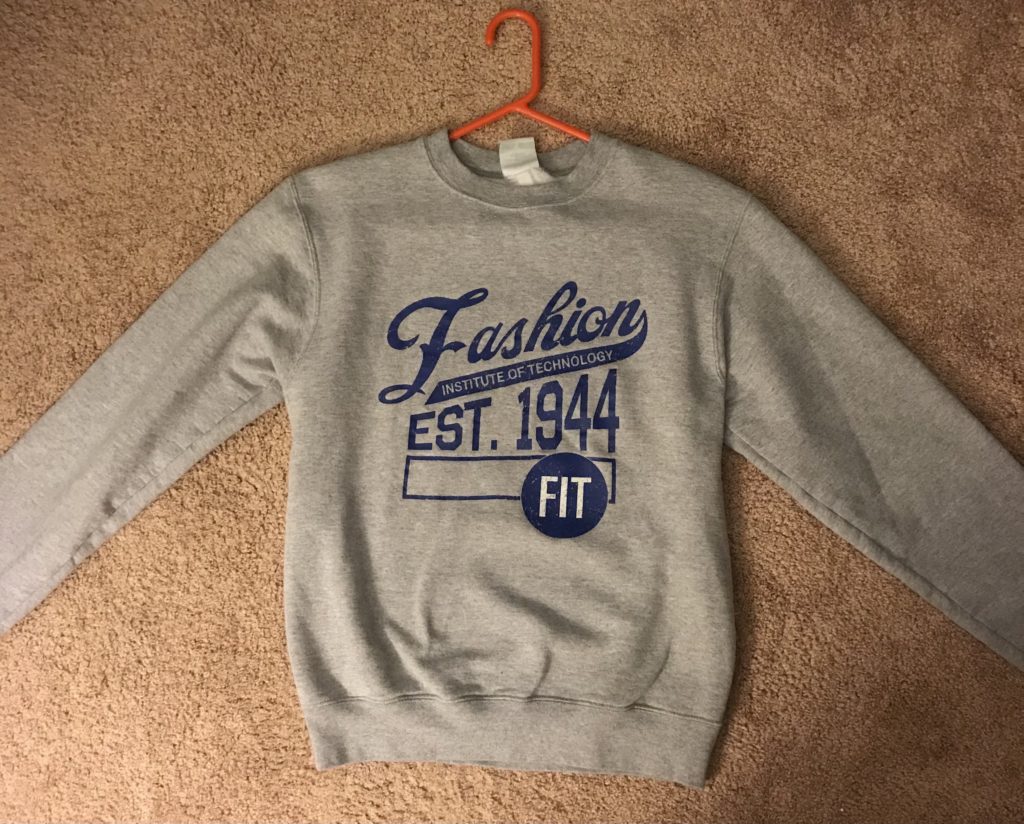
Good – The dark blue and the light grey contrast enough so that the words are legible.