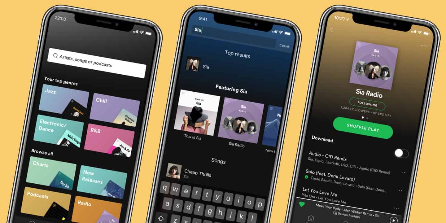
The app display is easy to follow and gives people suggestions to look through in addition to a clear library for saved playlists.
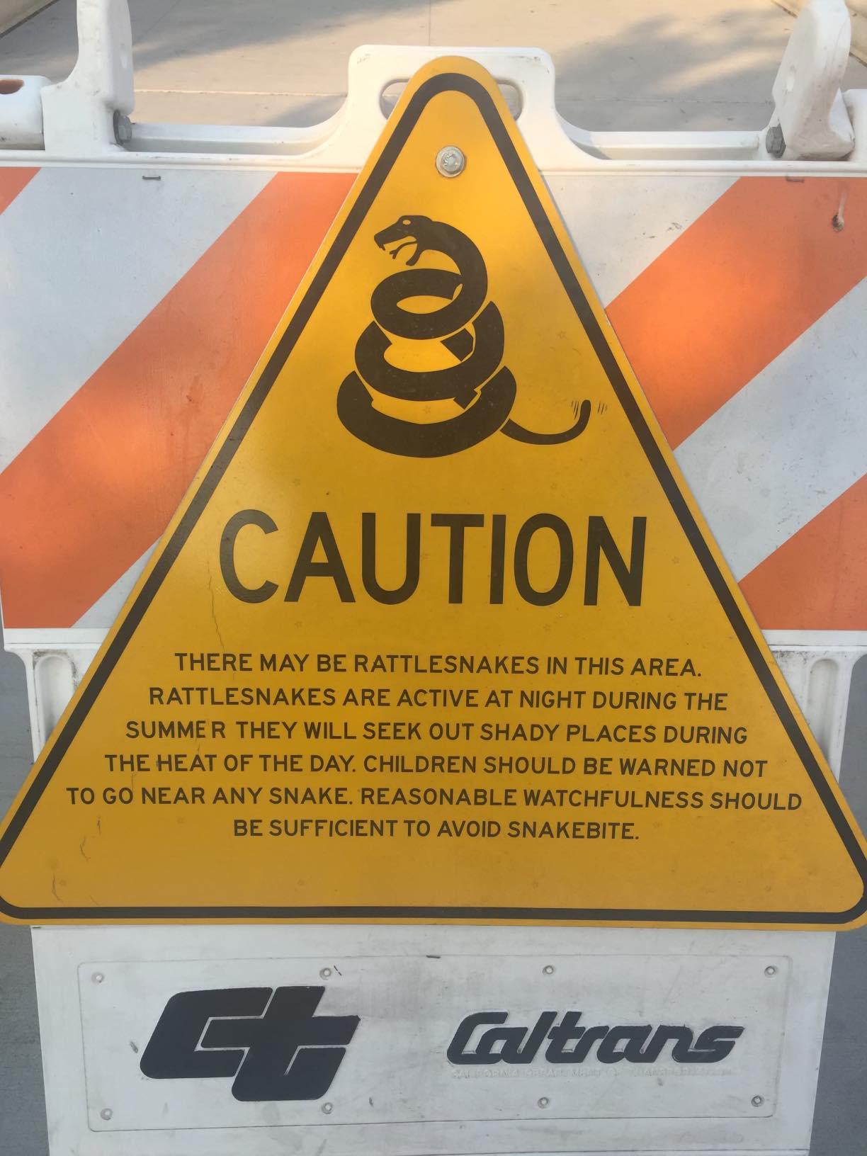
The sign, while it does have a lot of text, conveys the clear message of to look out for snakes. The additional text gives readers a more in depth warning so that they can stay safe.
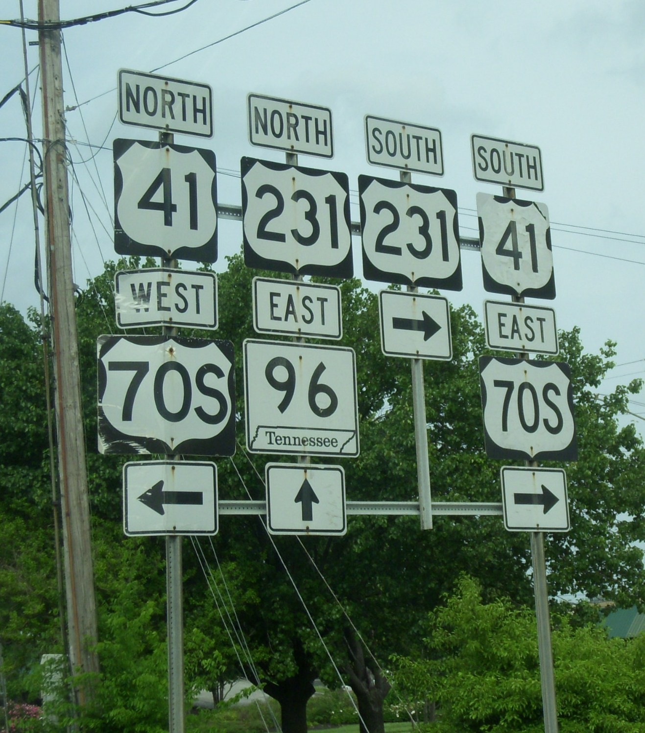
The street signs are a bad example of design because they are on top of each other making it incredibly difficult to see what direction which highway actually is.
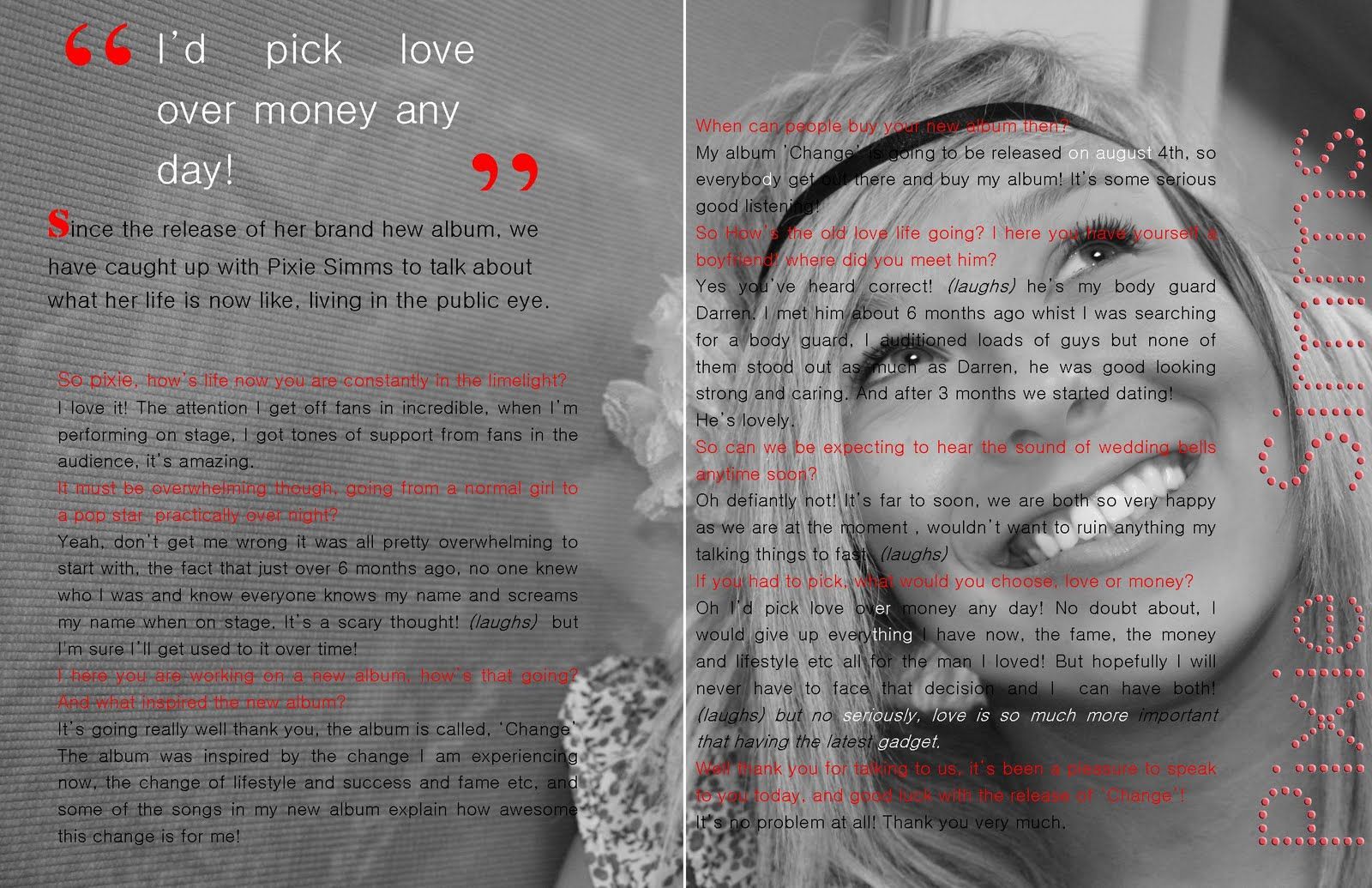
The magazine layout is poor because there is dark text placed of the dark image. This makes it incredibly difficult to read and even the read text does not come through well.