Goods
Batman Begins Poster by Kevin Tong

The bat is subtle, despite contrasting with the snow-capped mountains. Very clean design. Pale colors match batman’s story. Appears simple.
Drink and Drive Poster
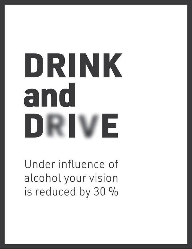
Effectively gets point across. The contrasting colors and the bold letters make the message clear. Implements part of the warning into design.
Bads
No Everything Im Is Possible
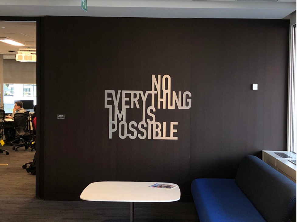
Message is very unclear. Sign is not even centered. Have to read right to left to actually get message. The BLE part of possible is connected for no reason.
Hotel Stairs

Safety hazard. Lines cause illusion that the stair is ending. The lines are not in a uniform pattern. Trim cuts off immediately at the end of the stairs.